How To DIY A Website For Less Than $20 A Month That Looks Way More Expensive

This article is brought to you by Squarespace.
For as long as I’ve been pursuing my love affair with all things design — specifically, graphic design — I’ve relished having the power to create things. Growing up, I was an incessant doodler and overachiever in the homemade card making department, always fiddling around with a craft project. Then, when I got to college and realized you could actually major in something called “graphic design,” everything clicked. My love of all things design found a productive outlet in school, and my amateur sketching turned into lettering practice, web design, and branding work.
Like most design students, I dabbled in HTML and web design, but I knew it wasn’t for me. Yes, it was empowering to learn basic code and see how it could transform a blank page into something special, but I knew my talents and skill set laid elsewhere in the ~designiverse~. A professor who sympathized with us “print designers” showed us how to easily create portfolio sites that would also make our work look sleek. The site he showed us was none other than Squarespace.
Since graduating, I’ve seen first hand how valuable it can be to have a good looking site — especially your very own portfolio site. Squarespace made it easy and intuitive to put one together, even though I didn’t personally know much about web design. It’s the first thing a potential employer, fellow creative, or a general career connection can look at to get a sense of you and your work. Having a beautiful website that clearly showcases you — and is intuitive to navigate — does what a paper resume can’t do: show (rather than tell) your story.
To help you guys visualize just how easy it is, I’ve pulled together a few steps on how to create your site quickly and beautifully on Squarespace, which is our website builder of choice at The Financial Diet (this one, for example, only took me a few hours!) It was easy to customize type, colors, fonts, pages, and navigation tabs, and refined enough to give my designer eye lots of options to choose from and flexibility to bring to life the portfolio site I wanted. And, what’s best is that anyone can do it. Hooray!
Step 1: Go to Squarespace.com and choose a template.
This might just be the easiest step. I’ve found Squarespace’s vast library of creative templates to be a lifesaver and having so many nice options to choose from means I don’t have to think about the mechanics of building a site and can instead focus on the work I’m showing off. Squarespace offers hundreds of templates for virtually any type of website, too — so while I’ve used it to put together a portfolio showcasing my work, you’ll also find templates for online stores, restaurant sites, event planning, blogs, and so much more.

Step 2: Personalize your template with your content.
Your portfolio site can be simple, but in order to be effective, it should be customized to best showcase the kind of work you do. In the clip above, we’re viewing a portfolio page and adding a new content block within the page I’m designing. Squarespace’s content blocks let you create a dynamic and varied page. There’s a lot of variety for types of content block, including: adding text, images, a gallery of images, contact form, buttons, quotes, and spaces (to name a few!) which means adding projects to your portfolio site can be super simple and quick.
Creative professionals like myself can use content blocks to showcase examples of their work. Even if you don’t work in a creative field, you can use Squarespace’s various content blocks to showcase your professional experience, such as case studies for clients you’ve worked with. Wedding and event planners may want to use content blocks to feature text and beautiful images that collectively capture the energy of an event they’ve worked on all on one page. If you’re using Squarespace to put together an online shop, you can use content blocks to feature your different products or services.
Step 3: Create multiple pages.
You probably don’t want to crowd your entire portfolio site onto one page, especially if you have different kinds of work to showcase. I added multiple pages for my various projects and design mediums — e.g. my designs made specifically for Instagram are on a different page than her customized smartphone wallpapers.
This clip shows how easy it is to add a page to your portfolio site on Squarespace using the navigation bar on the left-hand side of the page You have lots of choice when creating a new page type, and have the option of creating a “collection,” which includes things like creating an event page, an album page, or a product page, to name a few.
Depending on your reason for building a Squarespace site, you may only need a few pages — but separating out your content makes it easy for website visitors to find what they’re looking for. An “About Me” page is a great way to personalize your site and introduce yourself to potential clients and employers. If you’re putting together a blog or online publication, you can add pages for your various categories of content. If you’re an entrepreneur selling your services online, a page with client testimonials would be useful for showing your value to new potential customers. And, of course, you’ll want to have a contact page to make it simple and straightforward for your website visitors to get in touch.
Step 4: Monitor your analytics.
Once you’ve finished creating your portfolio site, you can use the “analytics” tab on the left-side menu to keep track of who’s visiting your site and where your visitors are coming from. You’re able to see your traffic sources and how people are finding your site based on keywords. The panel is user-friendly and easy to navigate, which means you can ascertain how much interest your portfolio is garnering and tailor SEO to help it thrive. This can be especially useful for showing up in potential clients’ search feeds, making your site easier to find.
Additionally, Squarespace’s analytics are beyond valuable for optimizing revenue for small businesses. If you run a blog, your bottom line may be dependent on increasing overall web traffic, and Squarespace makes it easy to see how people are finding your content (e.g. through Google searches vs. social media posts). If you run an online store, Squarespace can help you track your sales, including how much you’ve sold and earned, which products are most popular, and how much each revenue your various traffic sources are driving.
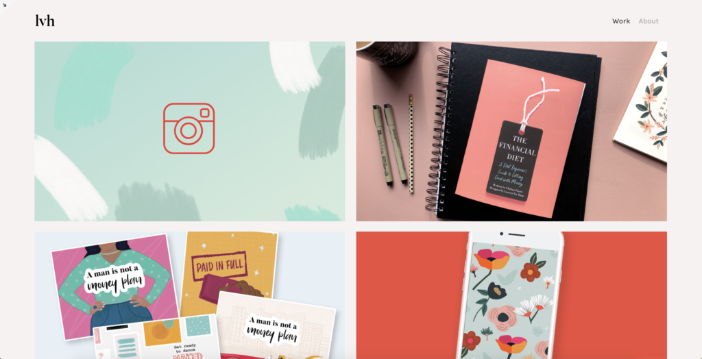
Here’s a few snapshots of my finished site, which you can take a look at here!
If you’re ready to get started building your own beautiful portfolio site, head to Squarespace.com for a free trial. With our offer code “FINANCIALDIET,” you can also save 10% off your first purchase of any website or domain.
Image via Unsplash
Like this story? Follow The Financial Diet on Facebook, Instagram, and Twitter for daily tips and inspiration, and sign up for our email newsletter here.


