Why Everyone Needs A Website, & The 8 Things It Should Contain
This article is brought to you by Squarespace.
Nowadays, it kinda seems like everyone has a website. There’s a good reason for that: everyone should! Even if you’re not freelancing, side-hustling, or otherwise working outside your day job, a personal website is an extremely useful professional tool.
My Squarespace-powered website has helped me network, land clients, and even impress interviewers who checked out my blog after I included it on my resume. All of us have a digital footprint, and a great website will only enhance yours. And unlike in the early days of the Internet (RIP), you no longer need serious money or tech skills to create a beautiful and functional website. And with Squarespace, you can create a dynamic, user-friendly one in minutes. Here’s what it should include:
1. Samples of your work
A portfolio is the first item on the list because it is, simply, your website’s primary reason for existing. No matter what you do or your level of professionalism, visitors to your site need to be able to get a taste of your work.
Designate a page or section of your website as your portfolio and clearly label it as such. You might name it “Work,” “Portfolio,” or something specific to your industry, such as “Clips,” “Writing,” or “Design Samples.” Regardless of the name, your portfolio should have a dedicated space on your website. And if you’re just starting out, remember that a portfolio doesn’t have to be made up of only paid work! Before I had any “real” clips as a writer, I used select entries from my blog as my portfolio. And with Squarespace’s hundreds of beautiful templates and customizable galleries, you can make sure your work stands out no matter what design skills you may or may not possess.
2. Your services
Your website should clearly state what you bring to the table. Are you an editor? Researcher? Content designer or social media wizard? Plant whisperer? If you offer it, put it on your site, and be specific. Many of us have more than one skill set that we’re willing to put out for hire, and you don’t want to assume that potential clients will know about all of them unless you explicitly say so. Even closely-related skills, like writing and editing, are worth spelling out clearly as distinct services. That said, be wary of listing so many services or skills that you seem unfocused. A tarot reader-vegan chef-performance artist may sound like a fun dinner party guest, but that’s not necessarily a hireable professional profile.
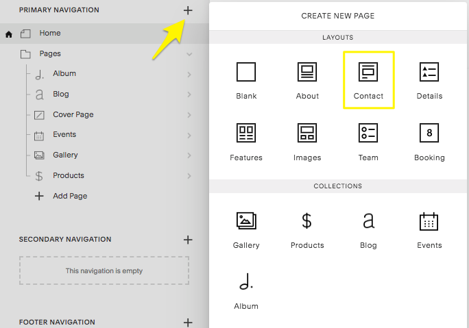
3. Your contact information on multiple pages
Second only to your portfolio, your contact information is one of the most important elements of your site. How else will potential employers and clients know how to get in touch with you after being wooed by your stunning website?
Create a contact page or add a contact block to the bottom of your site with a fillable form, in addition to linking your email address in several other locations on your site. Basically, the goal is to make your contact information as easy to find as possible. Some people advocate writing out your email address to avoid receiving spam (JaneDoe at gmail dot com). You do you, but personally, I like to link directly to my email. Does this mean I get the occasional spam item or bitter troll in my inbox? Yes! Does it mean it is extremely easy for editors to reach me, which is a Very Good Thing? Also yes!
And if you’re using your website to sell your side-hustle service, make sure you make it easy for clients to book you. With Squarespace’s customizable booking tools, you can easily add online booking and scheduling for your classes or sessions to your site. Say you’re running a dog-walking side business — clients can easily see the mornings you are and aren’t available and even reschedule if needed, taking the hassle out of coordinating calendars.
4. Your resume
Before you rush to copy and paste your resume or CV word-for-word onto your website, that’s not what I’m recommending here. Unless you work in a more “traditional” field like law or academia, posting your resume directly onto your website will look uninspired at best and out-of-touch at worst. (If you do think your resume should go on your website, then make sure to update that bad boy first.) You should, though, include a compelling but brief highlight reel of some sort. Feel free to get creative with where and how you do this. It can be a short paragraph on your home page, a bulleted list on its own dedicated page, or a section in your professional bio. Speaking of which…
5. Your professional biography
I, along with pretty much everyone else, firmly believe that your website needs a biography or “about” section. Even if it’s just a few sentences, your site should say a little about you. Bios serve the dual purpose of making you seem more like a real person, which is important during the ever-more-digital age, and setting you apart from the crowd. The ratio of serious to fun information in your bio will depend on your taste, industry, and objectives. Consider your audience and goals. Do you want to build an online community or blog following? Go full-time freelance? Create a repository of your work so your relatives finally stop asking when you’ll get a “real” job? Asking yourself these questions will help you determine what (and what not) to include.
6. A photo of yourself*
Similarly to your bio, a photo humanizes you and builds trust. Including a photo is also another way to personalize your site with minimal effort. Use it as an opportunity to bolster your professional ethos. If you’re a chef, caterer, or food writer, consider a photo set in a kitchen or at a market. If you’re a writer, like me, maybe show yourself writing or reading a book. A professional headshot is always nice, but it’s not necessary. Just make sure the photo has a decent resolution.
*Some people may prefer not to include photos for a variety of valid reasons, including racial or gender bias, safety concerns, or the need for anonymity (if your blog is about building up your savings to quit your day job, maaaybe don’t post your company headshot).
7. Your socials
Even if your work consists of translating ancient manuscripts by candlelight in a basement with no cell service, chances are you have at least one active social media account that you can link on your website. Highlighting your social media presence on your site has several advantages. It adds personal flair, professional credibility, and even another kind of portfolio.
And with Squarespace’s social media tools, you can arrange for your social media to populate directly onto your website. This is especially helpful if you regularly share your work (such as client work, design projects, or published writing) on your social media pages. Squarespace also pushes new site content to your social accounts in real time, and links from your social media to specific elements on your site, such as new blog posts or products for sale.
8. A design that showcases your professional personality
As my favorite writer Roxane Gay once wrote on Tumblr, “If you’re going to have a website,”—and you are now, right?!?—“don’t have an ugly website. There’s no excuse anymore.” And she’s right. Review other professional websites in your industry to get an idea of what works well. Check out TFD co-founder and designer Lauren’s how-to guide for putting together a Squarespace site here — some design options are better suited to particular fields or types of services than others. If you’re a photographer or graphic designer, you’ll want a web design with a strong visual element. If, like me, you’re more of a wordsmith, that kind of image-heavy template might not be a good fit. Squarespace even sorts their templates by category, so you can easily find what you’re looking for — whether you’re putting together a simple portfolio, or building out a site for your pop-up restaurant.
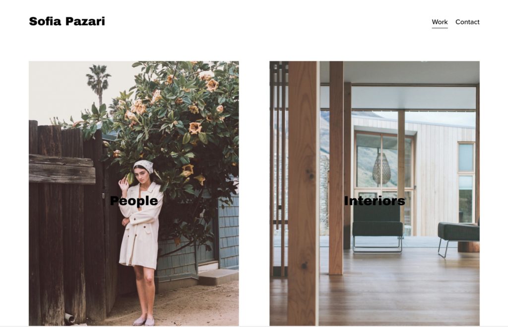
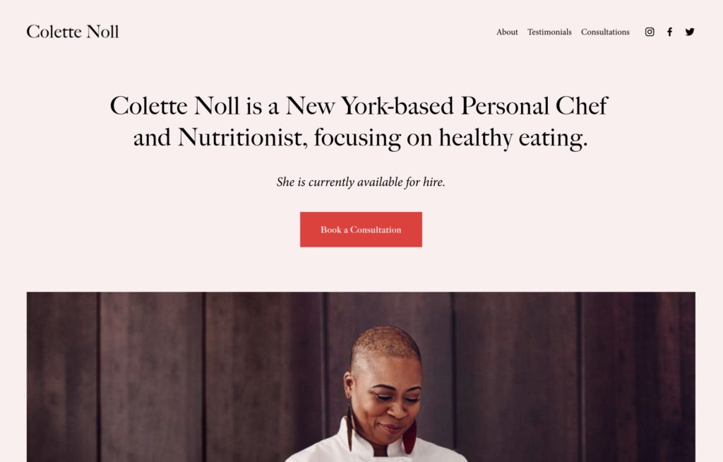
The two universal rules that hold true when selecting a design are (1) be yourself and (2) keep it simple. It’s easy for newbies to fall into the trap of thinking that you need a lot of stuff on your website in order to seem professional. You don’t. On the contrary, a cluttered site will make you look amateurish. The writers I emulate have sleek sites that offer a clear sense of who they are and what they do (check out a couple examples here and here). Think of your little corner of the Internet as your digital home. You want to show off your personality without providing too much information; it’s the difference between inviting someone into your living room and letting them look in your junk drawer.
If you’re ready to get started building your own personal website, head to Squarespace.com for a free trial. With our offer code “FINANCIALDIET,” you can also save 10% off your first purchase of any website or domain.
Sarah Doyel is a writer and researcher currently based in Tunisia by way of Washington, DC. When she’s not behind her laptop, she’s running, reading, or drinking an entire pot of espresso. Read more of her work at www.sarahdoyel.com.
Image via Unsplash
Like this story? Follow The Financial Diet on Facebook, Instagram, and Twitter for daily tips and inspiration, and sign up for our email newsletter here.