Basic Decor Rules That Will Make Your Home Look Like An Apartment Therapy Photo

For the most part, I am not highly susceptible to the Comparison Game. A flawless face of makeup, a perfect couple’s photoshoot on a stranger’s Instagram feed, a friend’s lavish vacation pictures — they don’t bother me much. Call it self-actualization, call it indifference, call it pathology, but it is what it is: I am, for the most part, oddly immune.
But we all have our Achilles’ heel, and mine is home decor.
An Instagram grid or Pinterest feed of stunning, breezy living room shots and spotless yet lush bathrooms can lead me to actively hating my shower curtain. Many of my friends are blessed with a natural gift and zeal for curating a beautiful space, a gift I simply do not have, and their tasteful jewel-toned furniture and charmingly arranged mantles wound me to my core. How dare they turn their homes into stunning odes to the best of mid-century modern? How dare they have the audacity to beautifully incorporate original art into their gallery walls while my own walls remain virtually bare?
Yet here I am, writing an article about home decor. You may be wondering why the hell you’d listen to anything I, a bitter and admittedly mediocre decorator, have to say on the matter. But my vulnerability to home coveting has forced me to research some basic knowledge of home decorating a survival mechanism, and virtually anyone can use what I’ve learned to their advantage.
Establish your style.
Ever noticed how some rooms make you feel comfortable, soothing, or energizing, while others make you feel antsy, overwhelmed, or out of place? There could be many factors that contribute to those feelings, but decor is one of them. Just as we gravitate toward certain outfits, we are drawn toward wildly diverse decorating styles — colonial, eclectic, modern, rustic, Scandinavian, the list goes on.
For example, Elsie Larson of A Beautiful Mess describes herself as someone who thrives in a low-contrast environment. Nearly every wall in her home is white, her floors are pale, and bright color is reserved for accents only. Meanwhile, TFD founder Chelsea Fagan refers to her decorating tendencies as more “maximalist.” One glance at her Instagram and you’ll see the rich colors, sleek gold details, and beautifully curated collections that make her feel at home. Their homes are as stunning as they are different, but they’ve identified the particular style they want and achieved it with their decorating choices.
You can do this, too! Save (or Pin) all those envious photos you see on Apartment Therapy or Architectural Digest. Pay attention to colors, construction materials, textures, and the overall quantity of items. Is there a theme you can pinpoint? What do they have it common? Pay attention to how different rooms — either in person or in pictures — make you feel.
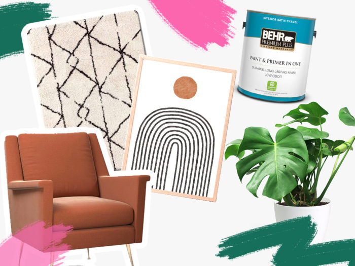
Then, identify patterns so you can choose items that make you feel good and avoid the ones that don’t. For example, my own home is full of blues, greens, wood, and natural fibers, with hardly any metal or glass to be seen, virtually no knickknacks, and an abundance of plants because that’s what feels right to us. If bold black-and-white patterns make you feel a little agitated, look for softer colors and patterns. If the tidiness of straight, stark lines soothes you, opt for a modern look. If you’re extremely tactile and love texture, go nuts with a jute rug, lush blankets, and velvet pillows. The person who most needs to feel at home in your space is you.
Dare to be odd.
I have a theory: Real Simple Magazine is contractually obligated to tout the power of odd numbers at least four times per calendar year. In case you haven’t heard this rule before, let me explain. When you’re choosing and arranging items in a decorative capacity, aim for odd numbers. Your brain likes the visual appeal of odd numbers. Think three decorative vases or plants, five votive candles, nine components on your gallery wall. To keep any of your groupings from being too matchy, find ways to create light variation between them. Your vases could be different heights, your gallery wall elements can be different sizes, or your throw pillows can be different colors or textures.
Of course, these rules don’t necessarily apply to things that are used in pairs or for sets of people. You can maybe get away with having five dining room chairs if your table is round, but make sure you have a sixth stored in the closet. If you like the whimsy of mismatched cutlery and flatware, live your truth! Just don’t be the weirdo who buys nine dinner plates, please.
Create “moments.”
Most rooms will have one element or space to which your eyes are naturally drawn. This is the room’s focal point, a buzzword I’m sure you’ve heard before. In some rooms, the focal point will be obvious, such as a fireplace and mantle, library shelving, or the dining room table. But in many cases, you get to choose and create your own. In a recent episode of A Beautiful Mess podcast, Larson talks about the similar strategy of “photo moments” for designing rental properties. “This can be indoor or outdoor. It can be a mural, it can be a wallpaper wall. Choose your moments, and spend more money on those moments to make them really good.” Big mirrors, accent walls, and specific pieces of furniture make great focal points.
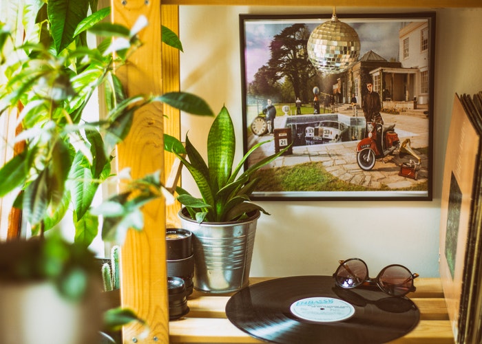
I recommend choosing and creating focal points or moments based on how you use your spaces. If you spend most of your living room time on the couch, put your focal point, be it an accent wall, a favorite art piece, or a great bookshelf, somewhere you can enjoy it from your favorite lounge spot. If you spend a lot of time in your kitchen, create a little kitchen altar, à la Joy the Baker. Hop on the bar cart trend and make yours utterly charming. Even if your focal point is just your TV, you can make it beautiful by placing it on a shelving unit you can fill with plants, books, and special items.
Once you’ve established a focal point, the art you choose to complement it can elevate the entire room, turning an ordinary wall into something that feels intentional and alive. Art has the ability to anchor a space emotionally, creating a mood that ties everything together—from the colors in your throw pillows to the light that filters through the windows. Whether you’re curating a single statement piece above the sofa or arranging a gallery wall of smaller prints, the balance between scale, texture, and personal meaning is what makes a space feel complete. Many homeowners and designers today are exploring new ways to access high-quality prints that reflect their taste, and the rise of POD for art businesses has made that process easier than ever. By enabling artists to create, print, and deliver stunning artwork on demand, it opens up a world of possibilities for decorating homes with unique, museum-quality pieces that feel both personal and timeless.
Follow spacing and measurement guidelines.
Obviously, you know by now that you should measure everything before you buy it, right? It’s very important to make sure you know your dimensions before you hand over your hard-earned dollars, lest you end up with an entertainment center that blocks off a nearby door, à la Friends. You should also take into account the way you move around your space. If you can’t sit on your couch without your knees banging into the coffee table, for example, the coffee table needs to be moved (or replaced, if it’s just too big for the room). Here are a few guidelines to think about:
- Rugs: In the dining room, your table and all your chairs should fit on your rug with room to spare, so the rug doesn’t get bunched up under chair legs and cause a tripping hazard. When you’re choosing a rug for the living room, you should aim for something big enough that the front two feet of all your furniture can rest on it. This ties the space together and acts as an anchor. You can go smaller if you want, and let the rug sit in the middle of the room without anything on it but the coffee table, but be wary of going too small, lest the rug loose its power.
- Art: Aim to hang or arrange your art around eye level, usually about 55 to 60 inches from the floor.
- Curtains: Mount curtain rods about four inches above your windows. If you want to create the illusion of height, you can go up to eight inches. Because your curtains hide your window frames, you have more wiggle room when it comes to the width of your curtain rod. Anywhere from one to twelve inches can work if you’re thoughtful about it.
Resist the urge to fill every space.
There’s a reason why realtors encourage you to remove 50% of your personal belongings from your house before selling it. It’s the same reason we find hotels and good AirBnbs so soothing: We like tidy, uncluttered spaces.
I’m not saying you should aim for the bleakness of a sitcom bachelor pad, with nothing on the walls, no lamps or couch blankies, and a bed adorned with one limp pillow and the cheapest jersey sheets Target has to offer. But you can strike a balance between that and the rooms you see in Architectural Digest. Not every wall needs to be a gallery wall—or host any art at all. Not every shelf needs an array of tchotchkes. Not every table needs a stylized tray or vignette of keepsakes. You are allowed to have bare spaces.
In fact, an understated area can accent a highly styled one, because it doesn’t draw attention away from your main focal point. And as someone who doesn’t particularly enjoy dusting, I will mention that keeping some surfaces bare does cut down on that particular chore.
That being said, if you are a maximalist at heart and want every surface to be a feast for the eyes, go for it! Just be thoughtful about it: Make sure it truly enriches the room and delights you.
Light your room multiple ways.
I have inherited a great many traits from my mother, the most idiosyncratic of which is probably her deep-seated disdain for overhead lighting in large rooms. In her/our opinion, a single overhead light fixture is too weak to imbue a good-sized space with evening coziness, making it feel like a warehouse. As a result, my mother is the queen of lamps and creative accent lights, strategically placed to allow for a golden glow in every corner without turning the room into a migraine breeding ground.
Her rule of thumb is three sources of light. Whether or not you count the overhead fixture is up to you. Table lamps and floor lamps are great options and readily available at every price point, plus they come in a million variations (single bulb, multiple bulbs, cloth shade, frosted glass shade, Tiffany-esque, cantilever arms, the list goes on). You also can place globe accent lights on mantels and china hutches to create a soft glow in dark corners. There are even grown-up ways to decorate with twinkle lights! String them overhead bistro-style, drape them over a big mirror or your mantle, or stuff them into a vase with baubles.
Set your own rules.
This is perhaps the most important rule of them all. If you love oversized furniture clustered around a patchwork of tiny rugs, go for it. If you want a lava lamp in every room, go for it. If you want to commission an eight-foot oil portrait of your dog in Victorian garb for the single bare wall in your tiny studio apartment, go for it.
Your home should, above all else, be a reflection of what “home” means to you.
Maggie Olson is a marketing professional and freelance writer and editor living in northeast Ohio. She is a voracious reader, a meal prep enthusiast, and a yogi/hiker/biker/runner/kayake
Image via Pexels
Like this story? Follow The Financial Diet on Facebook, Instagram, and Twitter for daily tips and inspiration, and sign up for our email newsletter here.


